
Swiss style in design: the grid, Helvetica and an order that never goes out of fashion

Helvetica is everywhere. On the train station sign, on the medicine box, on your tax form, in logos you never connected with each other. You look at it every day without noticing - and that was exactly the point. The people who made it wanted the letter to be invisible, so the message could speak for itself. That idea is almost seventy years old now. It is called Swiss style. And the funny thing is you see it best not on a 1950s poster, but on your phone screen.
It has another name too: the International Typographic Style. Two names, one thing. It grew in Switzerland in the 1950s. At dede we design in this language every day, websites included, because nowhere does it work as well as on the web. First where it came from, then the real point: how to build sites in this spirit that are readable, fast and do not age in a year.
A short history of the style
Swiss style grew out of the avant-garde. From the Bauhaus it took "form follows function", from the Dutch De Stijl the geometric discipline of Mondrian, from Russian constructivism the belief that design serves the reader, not decoration (Wikipedia: International Typographic Style). The man who gathered it all was Ernst Keller (1891-1968), a teacher at the Zurich Kunstgewerbeschule from 1918. He told his students one thing: the design solution should come from the content, not the designer's taste. That sentence is the foundation of the whole school.
The style grew from two centres. In Basel, Armin Hofmann (1920-2020) and Emil Ruder (1914-1970) were more experimental, in love with typography and contrast. In Zurich, logic ruled, and its face was Josef Müller-Brockmann (1914-1996), who took over the department after Keller in 1957. For him design was closer to mathematics than art: the grid, the system, measurable order. His legacy is what you see most clearly on the web today.
The principles fit into a few points. The grid as the foundation of every layout. Sans-serif, neutral typography, because the hero is the content, not the typeface. Asymmetry and left alignment with a ragged right edge, never centring. Objective photography instead of decorative illustration. White space as a tool of order, and the objectivity of a designer who is a neutral carrier of information, not an artist.
Three typefaces tell this story. Akzidenz-Grotesk, a 19th-century grotesque the early Swiss loved for its plainness. Helvetica, designed from 1956 by Max Miedinger under Eduard Hoffmann at the Haas foundry near Basel, released in 1957 as "Neue Haas Grotesk" and renamed in 1960 by Stempel to Helvetica, meaning "Swiss". And Univers by Adrian Frutiger (designed 1954, released 1957), the first family with a logical numbering for weights and widths. That is the history. Now to what it means for designing websites.
How to design websites in the Swiss style
The rules made for print moved to the web better than to any other medium. The screen is a grid. The browser is a machine for arranging blocks. The Swiss gave us a ready-made language before the first CSS layout existed.
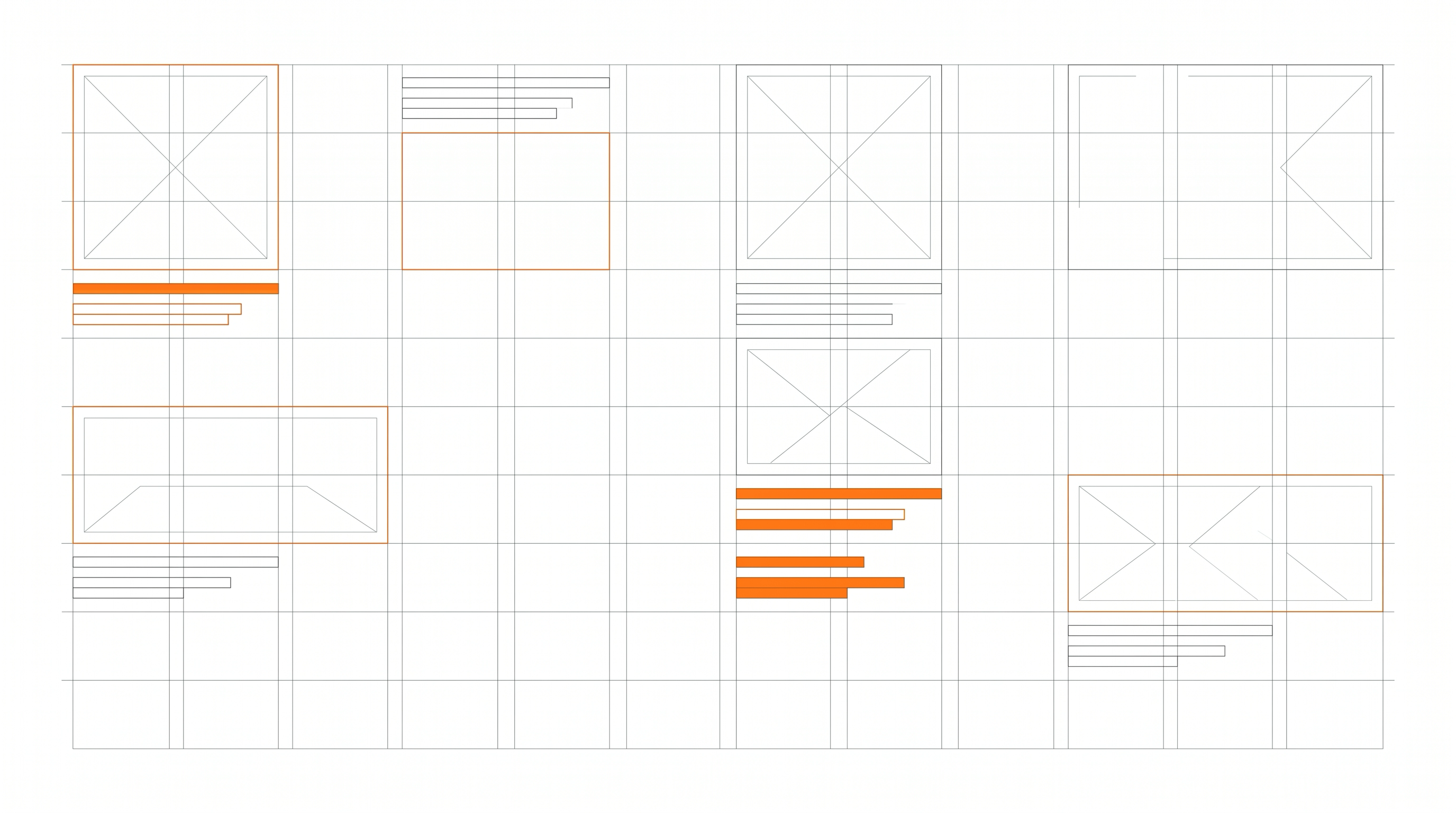
The grid, which is what CSS Grid does today. Müller-Brockmann saw the modular layout as the clearest way to order information, and he wrote a whole book about it: "Grid Systems in Graphic Design" (1981), still in print. When I look at his grids from the 1960s, I see the ancestor of the twelve-column grid that is now a frontend standard. A page is built on columns and modules: you set the number of columns, the gutter width, the max-width of the content (usually 1200-1400 px), and every element gets its place. CSS Grid and Flexbox are simply modern tools for the same job. Add to that vertical rhythm - consistent spacing between sections based on one base unit (say 8 px), so the page breathes evenly from top to bottom. Nothing "by eye".
Typography: fewer typefaces, more discipline. Sans-serif, neutral, readable. In print it was Helvetica and Univers, on the web you have Helvetica Now, Neue Haas Grotesk, and from the free, screen-optimised side - Inter. Arial as a system fallback will not let you down. The rule is simple: one, at most two typefaces for the whole site. You build hierarchy with size and weight, not with colour or decoration. A type scale helps, a set of sizes in a fixed ratio (say 16, 20, 25, 31, 39 px) instead of random values. You align text to the left, keep line length around 60-75 characters, because longer tires the eye, and set line height to 1.5-1.6 for body text. These are not whims, they are readability conditions studied for decades.
White space as an active element. This is the hardest thing to defend to a client who says "there is so much empty space here, let's add something". No. Empty space separates, groups and builds hierarchy. The gap between sections tells the reader where one thought ends and another begins, better than any line or box. On the web, white space also gives you something practical: a page that does not overwhelm on a small screen. Fewer elements in view means fewer decisions for the user.
Colour sparingly, one accent. A neutral base, meaning black, white and a few greys, plus one accent colour. At dede it is orange. The accent has a function, it does not decorate: it shows what to click, what matters, where the path through the page leads. When everything is colourful, nothing stands out. One strong colour on a neutral background works better than a rainbow.
Objective photography instead of stock decoration. The Swiss swapped illustrations for a plain photo that shows a fact. On the web that means real photos of the product, the team, the work, treated like blocks in the grid, not generic stock of smiling people in suits. A photo set into a module, with the same rhythm as the rest, does more than ten icons and gradients.
Why this style wins on the web
The arguments that decide this are harder than aesthetics.
Readability. A page on a grid, with one typeface and a clear hierarchy, leads the eye from the most important thing down to the detail. The user finds what they came for faster, and that turns into conversion.
Speed. Few ornaments means light code. No heavy animations, no dozens of background images, no effect libraries means better Core Web Vitals, the scores Google factors into ranking. Swiss minimalism and a fast page go together almost by nature.
Accessibility. Clean structure, strong contrast and clear hierarchy are exactly what WCAG asks for. A design that starts from order and readability is closer to meeting accessibility standards than a design covered in effects. And accessibility is no longer a nice extra, it is a requirement, a legal one too.
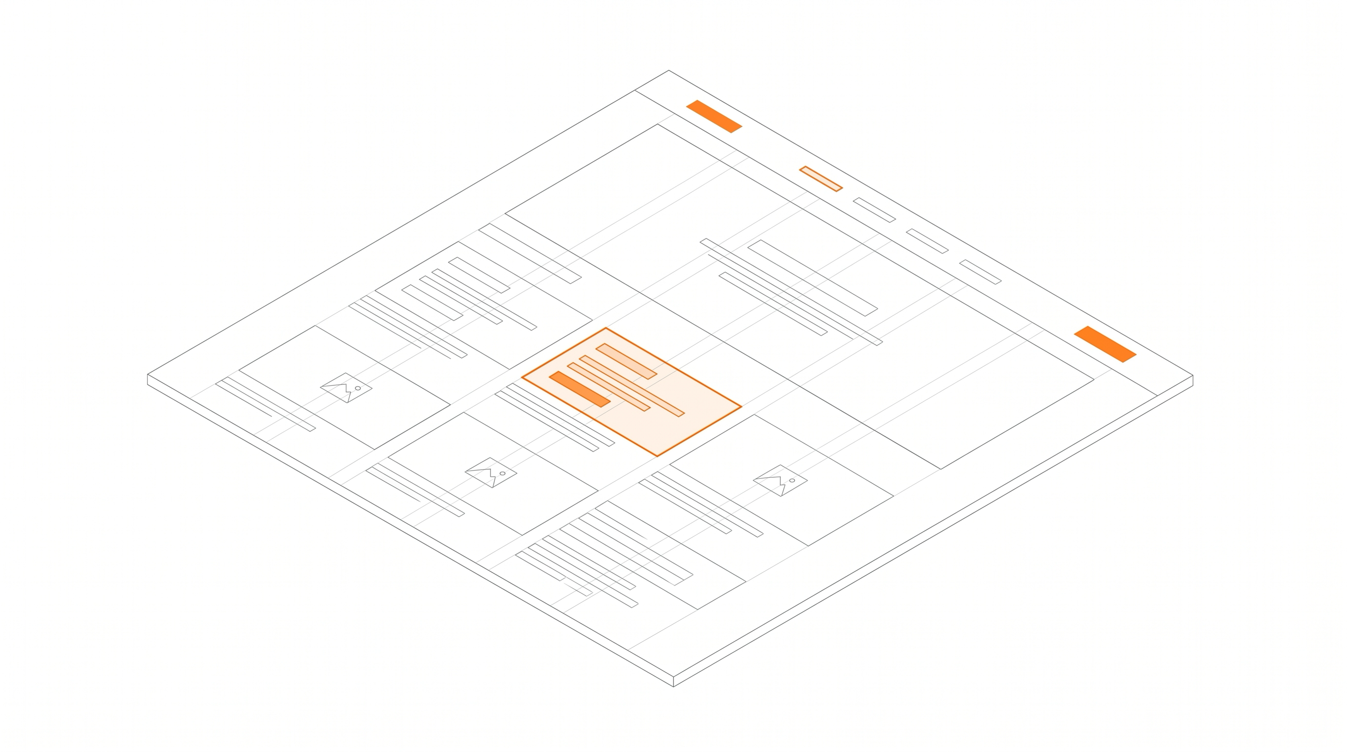
Responsiveness. A modular grid scales naturally. What has four columns on desktop has one on the phone, because the modules simply stack one under another. Mobile-first design, today's standard, is really thinking in Müller-Brockmann's modules.
Timelessness. Gradients, glow and trendy fonts age in two or three years. A clean layout based on rules from the 1950s still looks good a decade later. A redesign costs money, so a site that does not go out of fashion is a saving.
The biggest companies in the world prove it. Apple has built its sites on the grid, white space and sans-serif type for years. Stripe turned a clean, modular layout into a signature. Linear and Vercel show that minimalism can look modern and sharp. The New York MoMA site, and the portfolios of serious design studios, play the same language. It is no accident that companies that care about gravity and trust reach for Swiss order.
Where this style falls short and how not to ruin it
Swiss style was accused of being cold, impersonal and monotonous, and on the web that charge comes back twice as hard. It is easy to make a site that is correct, clean and completely without expression. The internet is full of identical "minimalist" landing pages that blur into one grey mass. The rebellion against the rigid rules came back in the 1970s, when in Basel Wolfgang Weingart began breaking the grid and mixing sizes, starting the New Wave. It was a healthy reaction.
The lesson for a web designer is this: keep the discipline, but do not fear character. A strong colour accent, typography with personality where it fits, good photography instead of emptiness, a touch of micro-motion on interaction. The Swiss grid is the foundation you build on, not a straitjacket. The best sites combine order with a bit of courage.
This is how we design at dede
We redesigned our own dede.agency site in exactly this spirit: the grid, plenty of white space, strong typography, one orange accent. Not because it is trendy, but because it works. We take the same approach to client sites, and our clients are mostly B2B companies where the message has to be clear, professional and consistent. In that world, readability and order beat showing off every time.
If your site is overloaded, slow to load, or simply looks like a hundred others, the problem is not a missing effect. The problem is a missing system. And a system is exactly what the Swiss worked out better than anyone before them. Let's talk if you want to bring order to yours.
Sources
Dates, names and historical facts in this post are based on the references below (some are also linked directly in the text):
- Wikipedia: International Typographic Style
- Wikipedia: Helvetica
- Wikipedia: Josef Müller-Brockmann
- Wikipedia (DE): Ernst Keller
- Wikipedia: Wolfgang Weingart
- PRINT Magazine: Swiss Style - The Principles, the Typefaces & the Designers
- About Switzerland (EDA): Swiss Style forever
- MasterClass: Swiss Design - 5 Elements
- Smashing Magazine: Lessons From Swiss Style Graphic Design


